Fuck It, Just Book It
A luxury travel brand built on one permission: stop overthinking.
The client
(The client)
Fuck It, Just Book It is a luxury travel brand for the traveler who already knows what they want and needs someone to make saying yes easy.
Its offer is curation, handpicked properties and collections, chosen so that person never has to wade through every option. FIJBI, the short form, carries the same personality wherever the full name cannot go.
Where we found them
The brand starts from one observation, written into its values: travel paralysis is real. Too many options, too much research, and a trip that stays in the planning stage.
The name answers it with a permission. The work was to turn that permission into an identity that feels bold and still reads as luxury.
What we saw
Nerve and elegance at once
The name swears. The identity had to keep that edge and still look like a brand people trust with an expensive trip, without one side canceling the other.
A long name, small places
The full name cannot sit on a wax seal, a favicon or a lapel pin. The brand needed a second mark that carries the same weight.
A voice that recommends
Luxury that sounds like a friend with exceptional taste: direct, playful, confident and warm, never a catalog or a search engine.
The plan
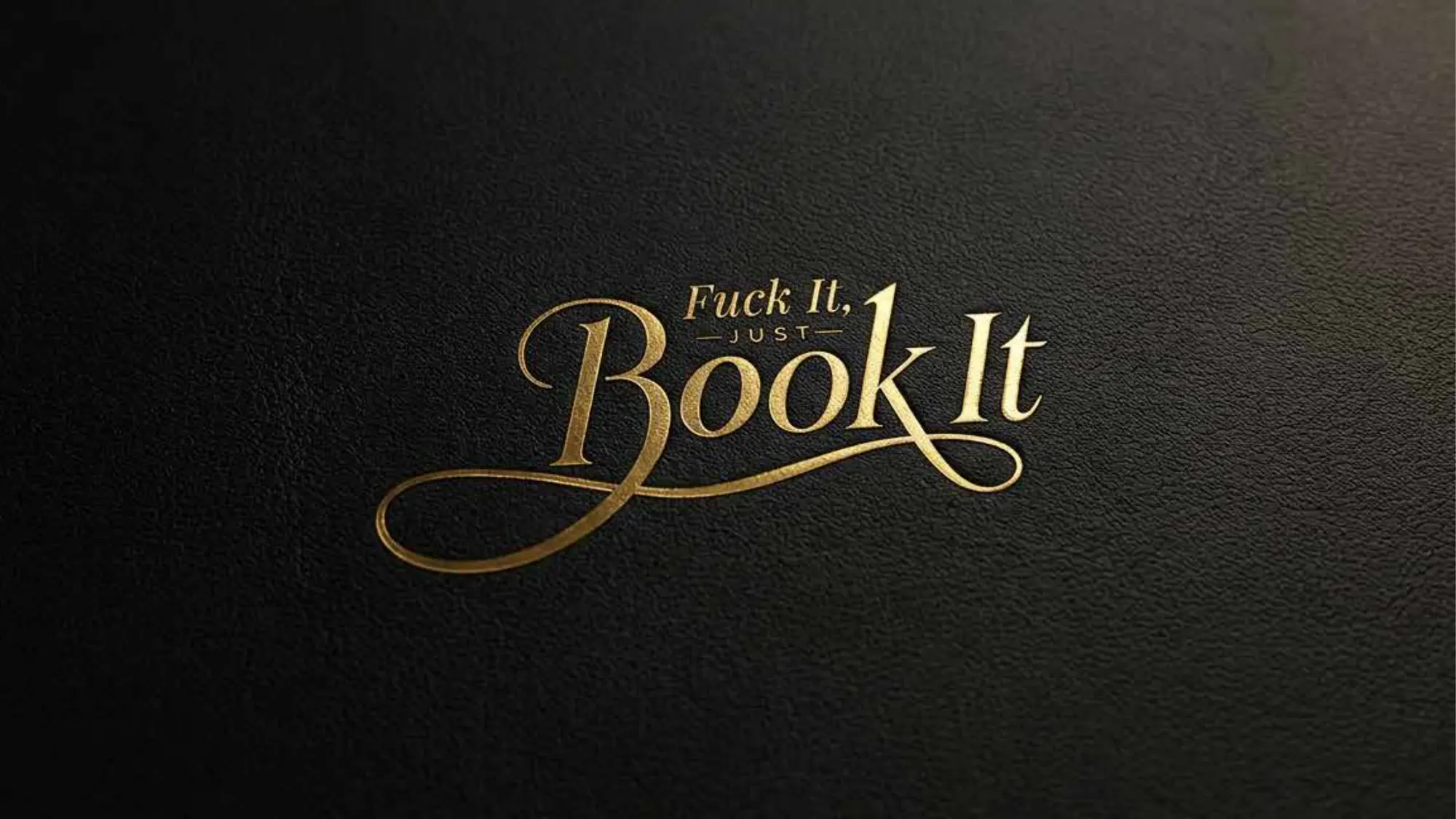
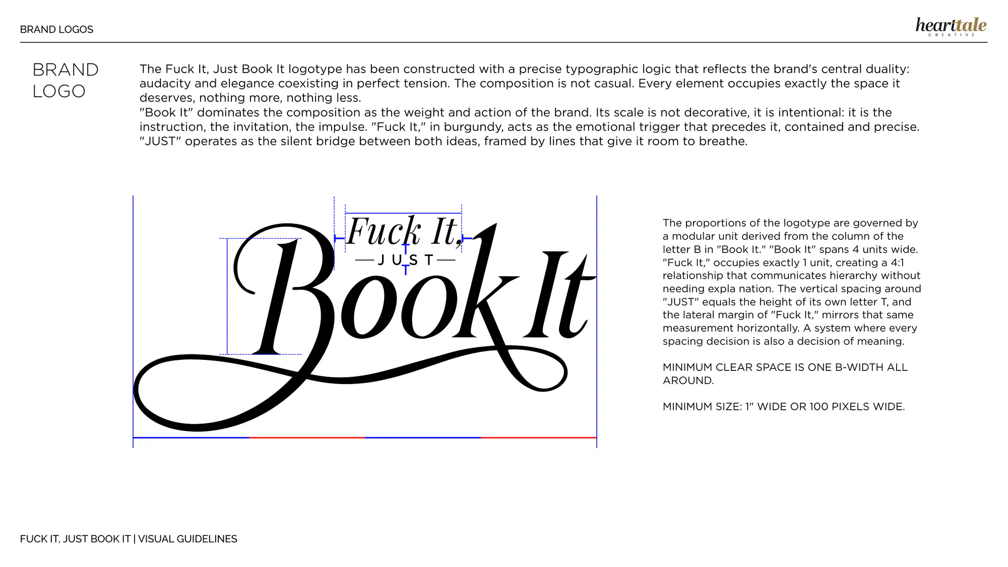
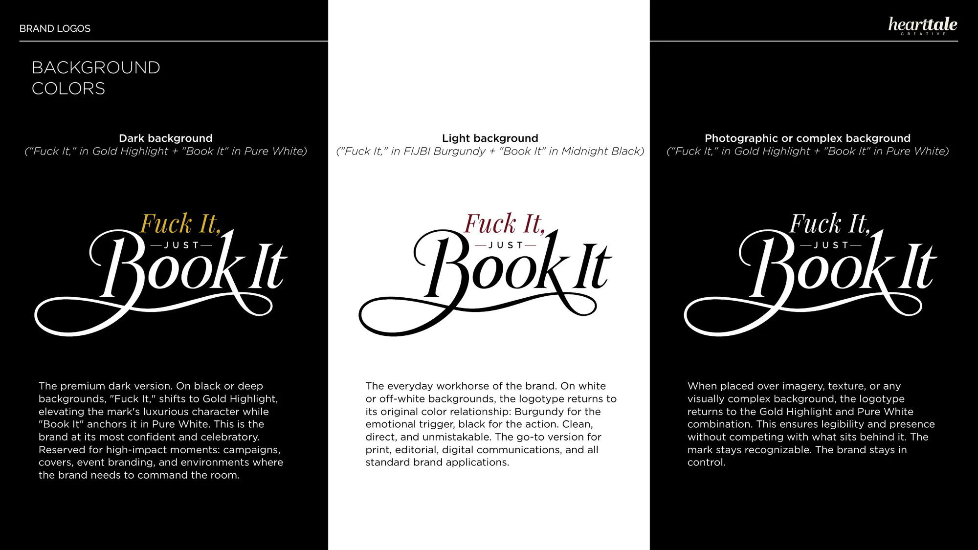
We built the identity on the tension inside the name. “Book It” carries the weight and the action; “Fuck It,” in burgundy, is the impulse that comes first, contained and precise; “JUST” is the quiet bridge between them.
Every rule followed from that: a proportion system for the logotype, a seal for the places the full name cannot go, a palette and three typefaces with one job each, and a voice written down so anyone can use it.
(What we built)
What we built
Thirty pages of visual guidelines: the marks and their rules, the color, the type, the voice and every way the brand must not be used.
The logotype and the seal
The logotype is built on a module: the width of the stem of the B in “Book It.” “Book It” spans four modules and “Fuck It,” one, a hierarchy that needs no explanation. Clear space and minimum sizes come from the same module.
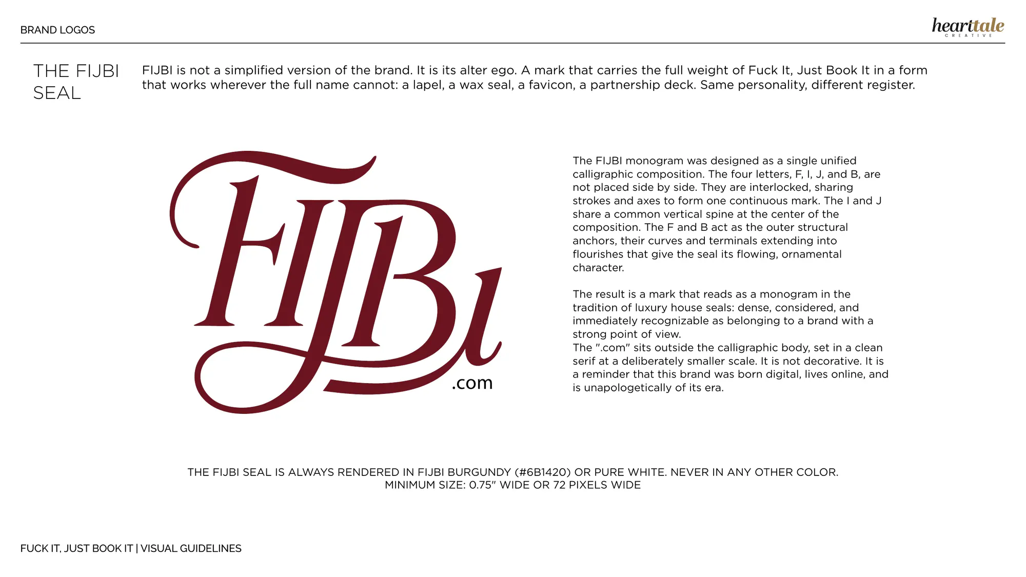
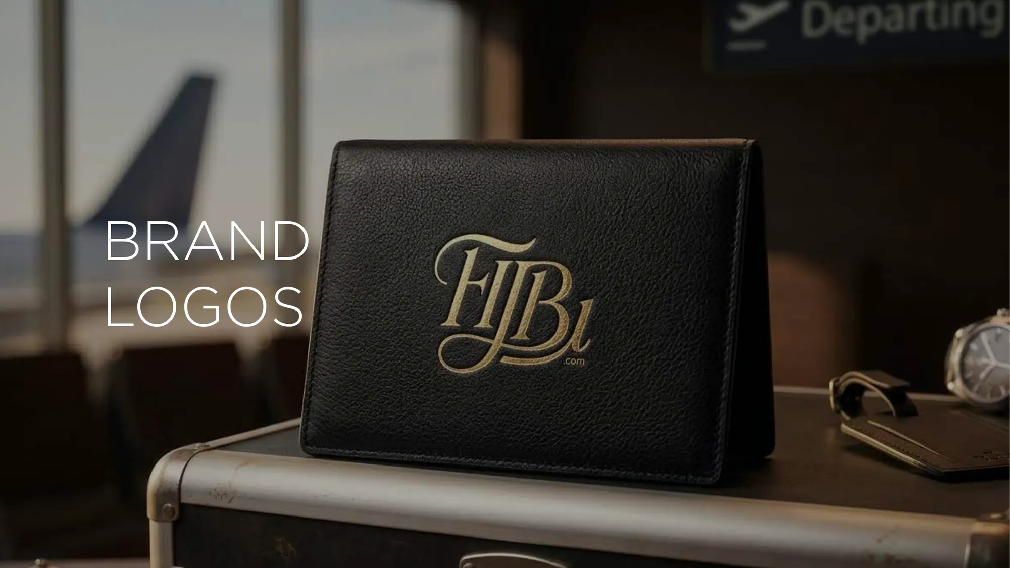
The FIJBI seal interlocks its letters on a shared spine, with a small “.com” set apart to say the brand was born digital. It only ever appears in FIJBI Burgundy or in white.
Color and type
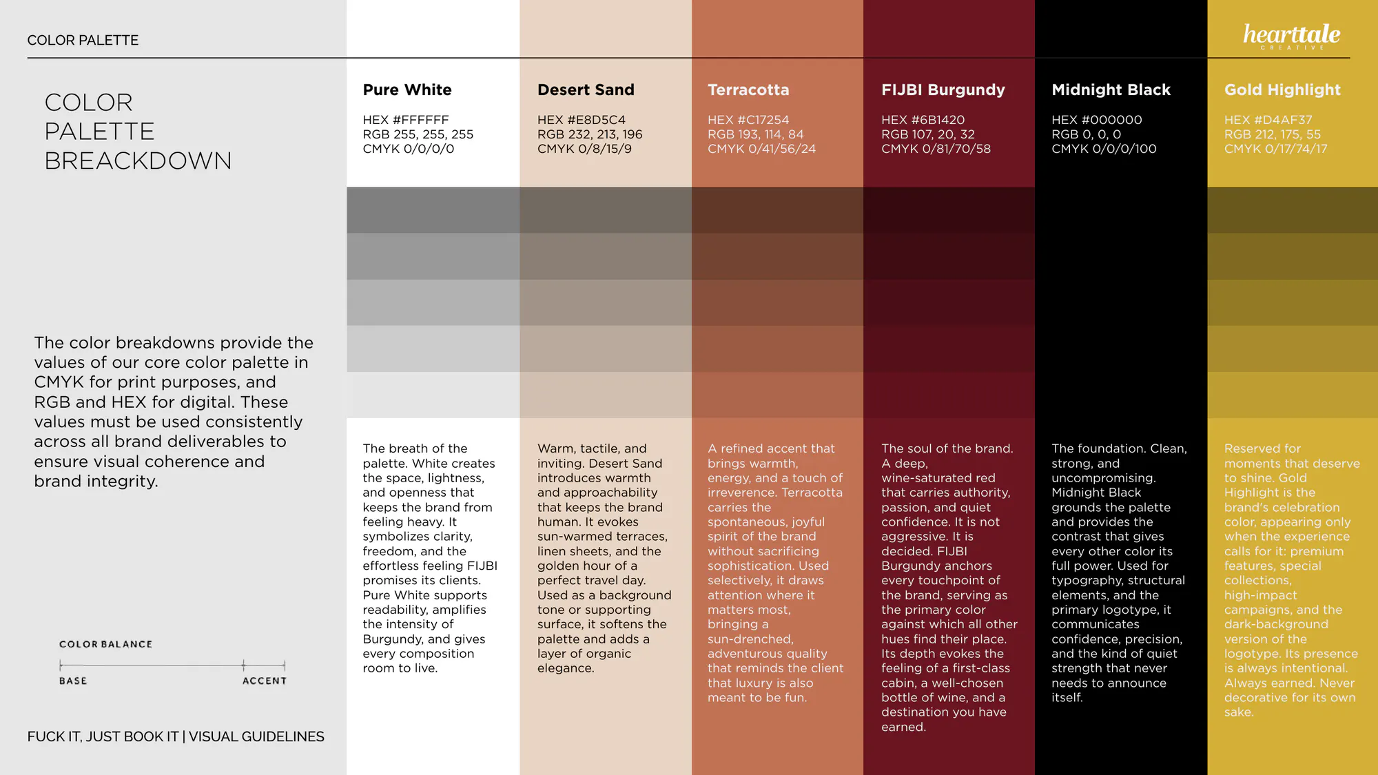
Six colors, each with its reason and its print and screen values: FIJBI Burgundy as the anchor, Desert Sand and white to let it breathe, Terracotta and Gold Highlight used sparingly, and Midnight Black as the foundation.
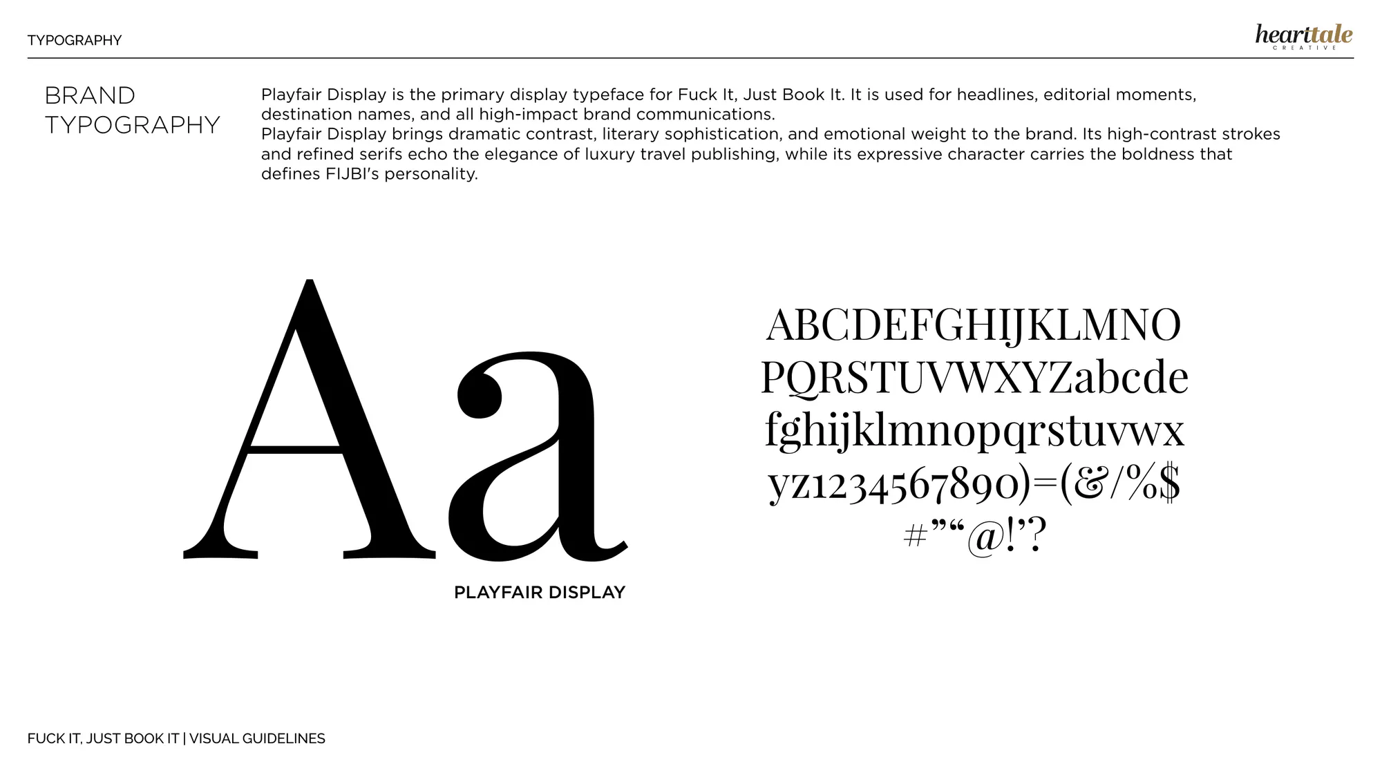
Playfair Display carries the headlines, Raleway the labels and navigation, Cormorant Garamond the long reading, and a custom script is kept for “Book It” alone.
How it speaks
Four pillars define the voice: direct, playful, confident and warm. The tagline puts the whole promise in seven words: “Your dream trip is one click away.”
What never happens to it
The guidelines show every misuse beside the correct version: altered colors, swapped typefaces, distortion, rearranged parts, added elements, cropping, low contrast and decoration.
- A logotype with a modular proportion system, clear space and minimum sizes.
- The FIJBI seal, for the places the full name cannot go.
- A palette of six colors with print and screen values and the reason for each.
- Three typefaces with defined roles, and a custom script for “Book It”.
- The voice in four pillars, and the tagline.
- Thirty pages of guidelines, with every misuse shown.
(The result)
Result
A brand with nerve and taste, written down so it looks and sounds the same everywhere.
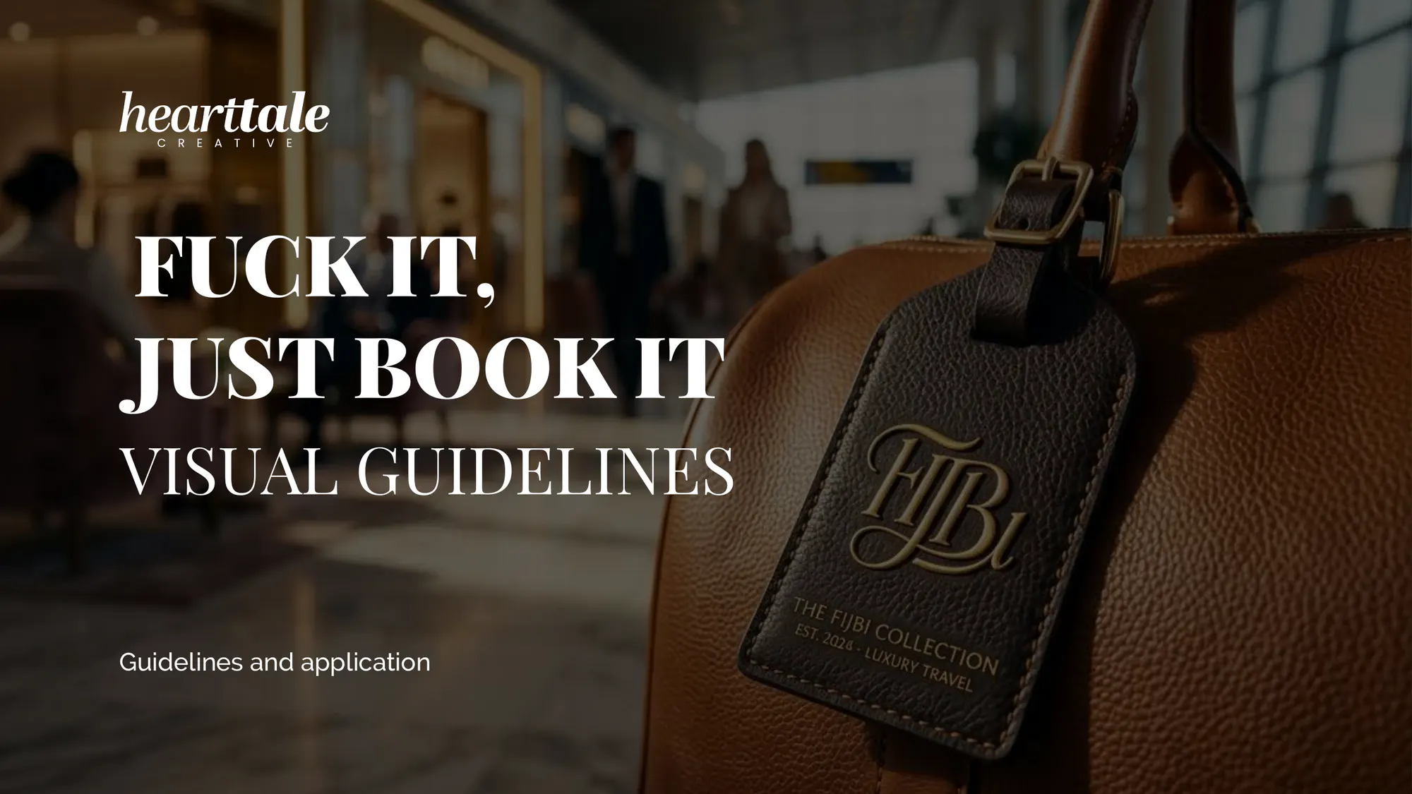
The guidelines give FIJBI what it needs to show up the same way on a luggage tag or in a partnership deck: the marks and their rules, the palette, the type and the voice, each decision with its reason.
- A name with an edge became a complete identity that still reads as luxury.
- One long name gained a seal that fits a favicon or a wax stamp.
- Taste became rules: measured, written down, shown right and wrong.
When I came up with the name for my brand, I thought bringing it to life in a way that would truly connect with the audience I wanted to reach was going to be incredibly difficult. But the work Hearttale did on the brand identity was exactly what I needed, and far better than I could have imagined. I’m so grateful that they helped turn a dream I had been carrying for a long time into something real.Valentina, founder of Fuck It, Just Book It
Services on this project
Have a project in mind?
hello@hearttalecreative.comOr use the form: three questions, two minutes. Start a project.